
Ouro HX · React component library
Designed down to the last tap.
Use today React 19 and Tailwind CSS v4
And down to the last prop. Ouro HX is a React component library that feels right to the people using it and is obvious to the agents building with it. It's copy-in source, not an npm package: shadcn's CLI drops each component into your app, where it's yours to read, keep and tinker with.

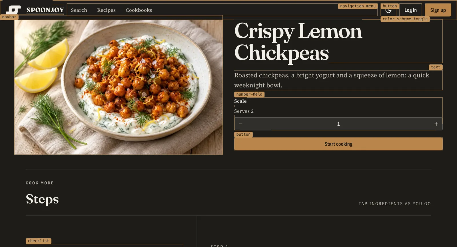
In the wild
Already cooking in production.
Spoonjoy, a recipe app, is built with Ouro HX. Each component's docs page links to where Spoonjoy uses it, so you can watch a component do its day job before you take it home.
Yours to keep
Copy-in source in the shadcn/ui registry format. Each component lands in components/ouro/, and your app's own Tailwind CSS v4 compiles it.
Keeps your theme
Components read shadcn's theme variables (--primary, --background, --radius…), so your shadcn theme stays put. Want the Ouro look? Add ouro-theme.
Phones get sheets
A dialog sits centered on wide screens and becomes a bottom sheet you can drag away on a phone.
Motion, minus the library
Motion is CSS, and reduced motion is honored in CSS. No animation library comes along for the ride.
Tests, if you want them
Each component's browser tests, stories and Playwright spec come as an optional -tests item, right beside it.
Agents read the manual too
llms.txt lists every item and the exact commands, so your coding agent installs components without guessing.
Install
A few commands, then a dialog.
In a Vite or Next.js app with Tailwind CSS v4 and an @/* path alias: run shadcn's init, add ouro-base once, then add any component. The @ouro namespace always serves the newest release.
# once per app
npx shadcn@latest init --base base --preset nova --yes --no-monorepo

# once, in components.json
"registries": { "@ouro": "https://ui.ouro.bot/r/{name}.json" }

# the tokens every component needs, then a component
npx shadcn@latest add @ouro/ouro-base
npx shadcn@latest add @ouro/dialog